Strava Route Explore
Mobile Cycling Navigation UX Case Study, 1/2
UPDATE: As of May 2021, Strava rolled out a significant update to their mobile UI and I took a look at some of the changes in a new write-up!
This is the first in a two-part series of case studies exploring cycling navigation in a mobile app environment. The subject of my first case study is the fitness-tracking app, Strava, geared towards recreational and competitive cyclists.
If you are a Strava user with your Facebook account connected, nearly every week you might receive a notification saying one of your friends just joined. Maybe it’s a friend from college or a distant cousin. If you don’t have a Strava, chances are you’ll join soon, thanks to COVID-19 Quarantine or a perhaps a New Years resolution to exercise more.
Strava is by far the most popular of the fitness tracking apps, and that’s thanks largely in part to its clean, modern-looking UI and branding, its easy-to-use functionality and of course the way it gamifies fitness. Many a think-piece and blog-post have been written about how Strava has ruined [insert sport here] by inserting an air of heightened competitiveness where it never was before. While this point is debatable, what’s not debatable is the proliferation of Strava in such fitness communities, it’s as ubiquitous as Twitter is to journalism and as Twitch is to gaming.
Strava made big news in mid 2020 by announcing one of their most fundamental features (leaderboards) as well as another very useful feature (route builder) were moving under their premium subscription umbrella. They claim this is so they can continue to improve these features while guaranteeing profitability into the future.
While it’s already one of the best fitness tracking apps, users both loyal and new will expect a premium experience worthy of the name and commensurate with the new price of admission.
The objective of this case study is to identify some of the long-standing UX and product feature oversights that keep Strava from being a thoroughly premium experience for both its free and paying users. This study covers three primary problems and their respective solutions.
Problem 1: No way to search or browse for public routes
Background
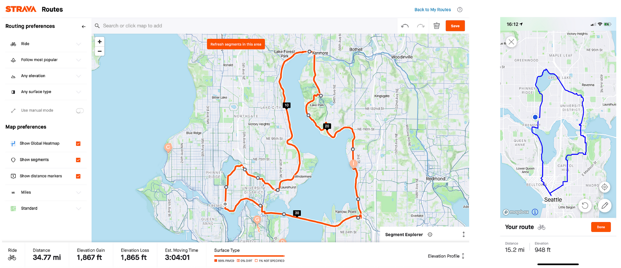
Strava has a useful tool that users can take advantage of to create new routes to run or cycle. Strava’s two most activity types are Cycling and Running, but as Cycling activities are typically much longer in duration, (cycling activities made up the largest by duration volume of activities recorded on Strava) and due to the exploratory nature of cycling as an activity, many users laud the Route Building feature.
Problem + Justification
However, though a user can save the routes and share them with others, there is no way to share and view them publicly. It’s easy to think of a use case for this. A rider moves to a new city or is on vacation: where are people riding? A cyclist who typically rides longer rides on the weekends is looking to do some short rides on weeknights: what are some good routes under 20 miles?
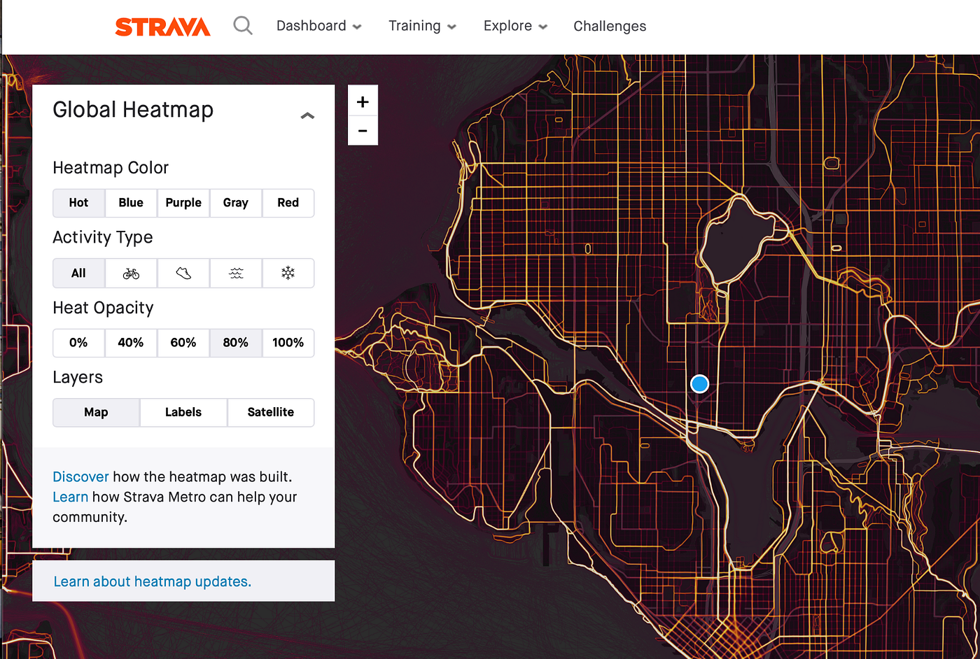
The current closest proxy to this is to rely on the cycling heat maps that are shown in the route builder. This tells the user with a visual hot-cold scale where the most travelled segments are when building a route. However to see routes that include one of those segments, they must view the leaderboard for that segment, and peruse the activities of other users. This is neither a direct, tailorable, nor discoverable process.
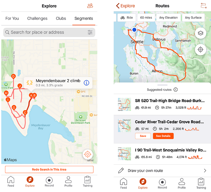
Another recent Strava premium feature that approaches this problem will suggest auto-generated routes presumably using heat-maps based off a few criteria (mileage, road surface, starting point). However, this feature is currently somewhat limited, and produces bizarre results. Expanding the search to include shareable user-created routes is a natural next step. One simply has to look to the Segment Explore function to envision an extrapolated solution for finding routes, wherein socially-created routes matching the user’s criteria populate the map.
A quick perusal of Strava Support boards shows a number of users who would gladly utilize this functionality. One of Strava’s competitors, RideWithGPS actually has searchable routes for which a user can then download the .gpx file, and import into Strava. Certainly Strava would prefer users spend more time on their own app.
An informal survey of Strava users among the author’s peers shows high interest in a feature of this sort, especially paired with the robust analytical tools already available within Strava.


Solution
It’s easy to conceive of a feature that combines the UX of the segment explore option with the functionality of the route builder to significantly boost user engagement and produce enormous value for subscribers. One only has to look to RideWithGPS for an idea of how it might look. The main functionality to gain here is Strava’s robust userbase and class-leading analytics (like the heat-map) as well as allowing the user to stay within the Strava social ecosystem. Further feature integration could easily follow, such as including user-specified segments or established points of interest in the route explore criteria.


As an exercise, I created a clickable low-fidelity prototype using Adobe XD to demonstrate how an Explore Routes feature might work, as well as a higher-fidelity, but less interactive comp for viewing purposes.

Problem 2:
Search for Friends/Other Athletes, Friend’s List not Discoverable
Background
As much as anything else, Strava is a sort of social media lite. It’s primary functionality is not sharing of content for the sake of content (there is real value in using it even without the social aspect) but much of Strava’s novelty is derived from the friendly competition. The more athletes one follows, the more potential to see interesting routes on one’s feed and the more people against whom to compare segment times.
Problem + Justification
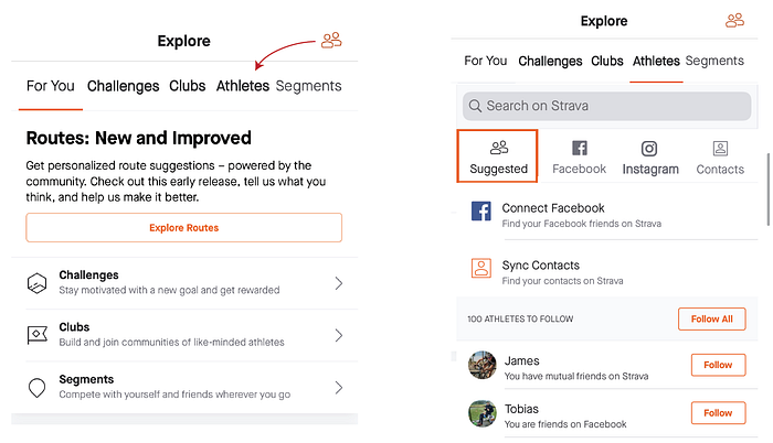
When the user desires to find friends to follow, there are a couple of issues that confound the experience. This is a problem in that has been slightly addressed in recent updates, but still remains not ideal. The icon that brings the user to the Search for Friends to Follow functionality is represented by two of the “profile” human figures stacked next to each other. However, it is stuck in the upper right corner on two pages Explore and Feed, not organized consistently with similar content. An informal survey of users among my peers reveals that some dismiss it as a secondary link to one’s own profile. It is not a memorable icon.
One user recounts: “clicking in 3 different places before I find it. And [I] can’t remember the location between larger breaks from the app.”


It would seem to make most sense among the categories in the Explore section, but it is kept separately. Currently, there is a small Suggested Athletes segment at the bottom of the Explore ‘For You’ page, with a small link to Find Friends.

In a third tab, on the user’s profile, the Find Friends button exists as a rectangular text button, instead of the icon used in the other two locations. This placement of the button makes sense. However, it might be wiser to choose one of the two iterations of the button to use across the app.
After the user has arrived at the Find Friends/Athletes page, there is a search bar, an invitation to connect the user’s facebook account and mobile contact list in order to suggest friends. Once this is done, there is a list of 100 athletes for the user to follow based off of these APIs.
Numerous users (via informal survey and support articles online) report frustration in finding the people they know on the app. Part of this may be that users meet casual riding friends via organized group-rides and learn their first names but not their last.
They will not likely have added them on Facebook, increasingly the case as fewer people use Facebook. Users report inputting a name of a friend that happens to be common and viewing search results with profiles originating in cities around the globe.
Solution
Instead of, or perhaps in addition to, Find Friends being a floating page accessible from various anchors throughout the app, it should have a permanent home in the Explore tab. Most of the existing links to Find Friends are helpful and should remain as supplementary access to the function.
To address the problem of the actual search function, one helpful change would be to introduce additional social media connectivity. Users are just as or more likely to follow new friends on Instagram than Facebook, so not including that set of potential athletes to follow is a missed opportunity. This could be done without compromising anonymity by merely suggesting athletes to follow only if both individuals follow each other on Instagram.
Another solution is to add finer search criteria to the Athlete search, particularly for those users who do not use social media at all. A city, state or zip code filter would help narrow down the results returned, especially if only a first name is known.
Problem 3: Inability to crop ride using mobile app
*Disclaimer: this feature was added in a recent update of Strava.
Background
After completing a fitness activity, sometimes the user will want to crop the activity to exclude particular irrelevant or inaccurate portions of the tracked movement. One frequent scenario occurs when the GPS tracker is left on when the user returns to their car and then drives off from the trailhead or point of activity. This is a problem because it can give the user incorrect Personal Records and/or launch them to the top of the Leaderboard, which is a very public mistake. Eventually this will get flagged by other users and the activity will be taken down. The fix for this is simple: crop the activity using a map or timestamp to only include the relevant data. This can be done easily on the desktop website, but can’t be done on the mobile app*.
Problem + Justification
If one wants to crop their activity without using a computer, one must request the desktop version of the website from their mobile browser to access the Crop functionality. This is a challenging process as the layout is understandably not optimized for mobile screens.
Including this function in mobile is increasingly important as a majority of the service’s day-to-day features are usable without ever accessing the site from a desktop computer. This is one outlier keeping Strava from being a nearly self-contained mobile experience.

Solution
A solution to this problem is as simple as creating a mobile UI for the crop function. It should function similarly to web, with a two-sided slider in addition to buttons on each side that incrementally crop the recording.

Conclusion
Strava has suffered from a lack of profitability in its first few years, in part due to the robust functionality available to its free users. Now that they have shifted some of its bread and butter features under a paid tier, they likely expect more paying users to follow. This is both an opportunity and an impetus to provide a flawless user experience for both their paying and free users. They have already begun rolling out big changes after what seemed like years of stasis (including one of the changes proposed in this case study, merely a coincidence, of course). Time will tell if they continue this trajectory and further cement their place as the premiere curators of fitness community.
Can’t get enough Strava content? Check out my write-up of the newest Strava update!